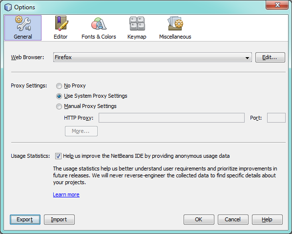
Todays UI oddity is small, but important, and it's something that has irked me ever since I started using NetBeans (when I joined the JavaFX team last year). Despite me picking on NetBeans here, this problem is common in many applications, and largely goes ignored or unnoticed by developers. I wanted to point it out as it is a very easy UI crime to commit, and one that can sometimes take a lot of effort to fix. Fortunately, in the cases below it would be trivial to fix.
In NetBeans you often get dialog windows like the one shown below. The problem is simply that the header area has a 1 pixel wide gray border around all four edges. This looks nice to delineate between the white of the header and the light gray of the main content area, but it looks really bad on the north, east and west sides of the header. Fortunately this is easily fixed.
 To back up my point, look at the screenshot below, which is again NetBeans, but a different dialog without the additional border on the north, east and west sides of the header. In my opinion it looks considerably cleaner:
 The only negative aspect is that the two border colours differ between the top dialog and the bottom dialog, but this again is an easy fix and just a matter of defining the default colour for header borders.
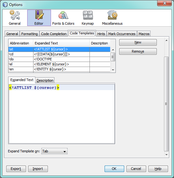
Finally, I wanted to point out another common example of bad borders, and was fortunate enough to find the following screen in my NetBeans install:
 This screenshot nicely shows the problem of nested borders. Look at the centre 'Expanded Text' tab. Inside this tabbed area is a rich text editor with its own border, but it is also wrapped within the border of the tabbed area. This looks untidy and cluttered. It's also worth nothing that the space between the inner and outer borders differs on each side. In my opinion the inner border (the rich text editor border) should be removed in this circumstance. It would lead to a visually less cluttered and cleaner dialog in a small way.
So, in summary, be careful of borders in your software. It's very easy to put components together and not really notice that borders are being duplicated like this. Finally, even though this is a NetBeans UI Oddity, it's very common all across the software world, so I'm not picking on NetBeans here :-)
Thoughts on “UI Oddities #2 - NetBeans”